ROLE
Mobile Design
DATES
Sept 2014 - April 2015
I have a passion for building social networking apps. I’ve always been interested in psychology and what drives human behavior. Today, people use their devices very often and I think it's great if they can meet new people through their devices. I see a big room for improvement in social networking space — which was one the major motivations to join Unravel.
I came on board at a very early stage, to build the app basically from the ground up. The team had just come up with a few sketches and rough prototypes.
DESIGN GOALS SUMMARY
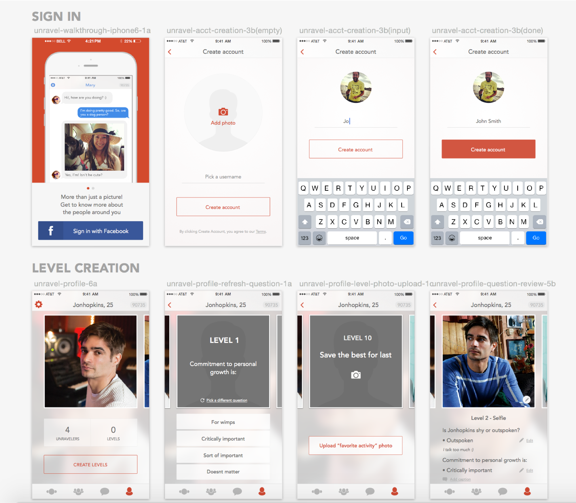
Design dating iOS app, with modern aesthetic, where the main feature is to unlock someone’s photos by guessing their personality. When two people have unlocked each others' photos — they can chat.
DESIGN METHODS
Sketching and storyboarding, wireframing, creating user flows, designing low to high fidelity mocks, conducting user interviews, A/B tests, focus groups, surveys, user behavior data metrics, usability testing.
We had a short deadline, so I had to design first version of the app within 3-4 weeks. The reason for that deadline is that we were asked to build a beta version fast and iterate on it later when we launch our beta in the UK.
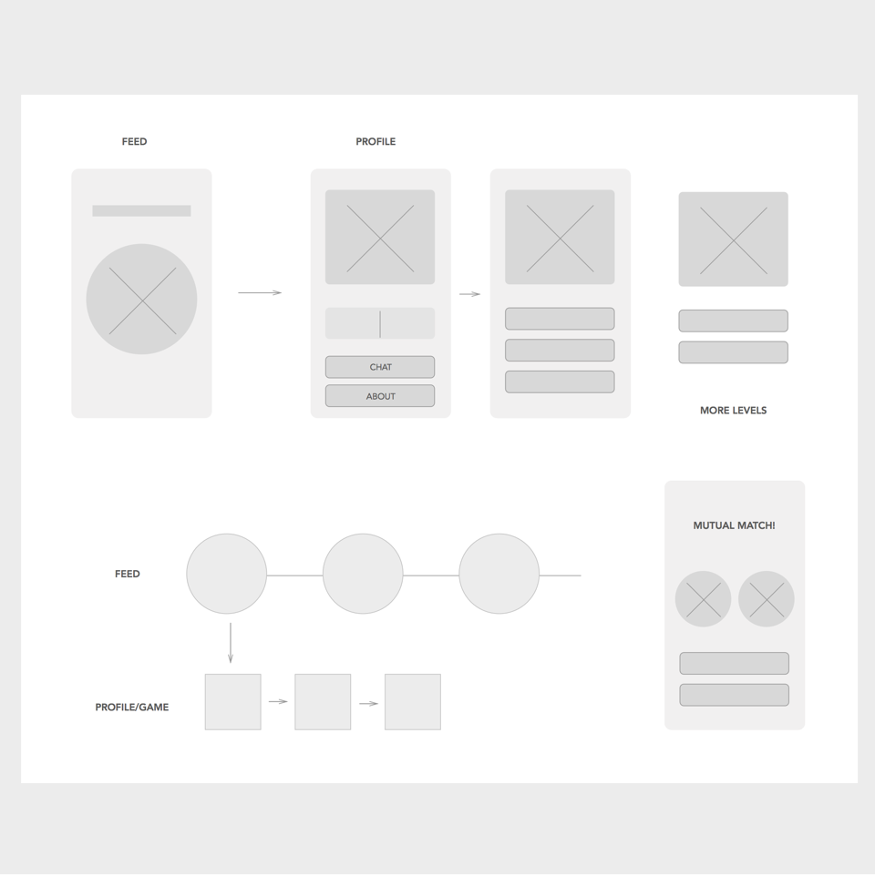
Early wireframes
After discussing and understanding our product goals, I started out by researching our competitors, which include major players such as Tinder, Hinge and Coffee Meets Bagel. I’ve studied their onboarding experience, branding, interaction and navigation patterns. We have noticed that the majority of them use blue as their primary color. We've concluded that red was the best color to convey the look and feel, as well as characteristics of our app, which is activity, passion, joy and sexuality. After a short team meeting we have decided to go with tomato (moderate) red.
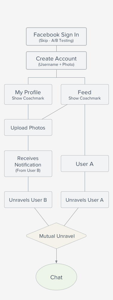
Typical user flow

Layout exploration sketches
One of our biggest challenges was to solve the content creation problem. People don’t like to spend much time writing about themselves, but at the same time they want to see a decent amount of information about their potential match. In Unravel you don’t write much about yourself, but you answer 3-10 personal multiple choice questions.
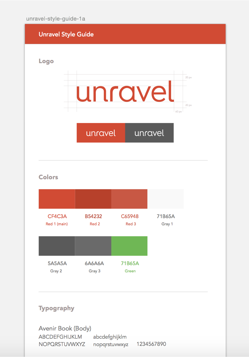
Basic style guide
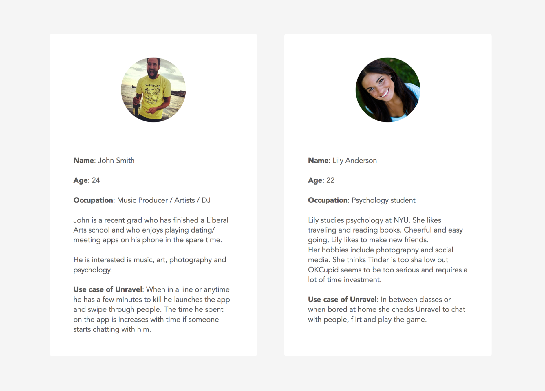
PERSONAS
To help the team and myself, I’ve come up with 5 simple personas as a way to model, summarize and communicate research about people who have been observed or researched in some way. It served us well in the future.
METRICS
When we have launched our beta in the UK in November 2014, we have been running A/B tests to see what flows, interactions and layouts work better for users. We have been focusing on retention, waterfall and engagement.

ACCESSIBILITY
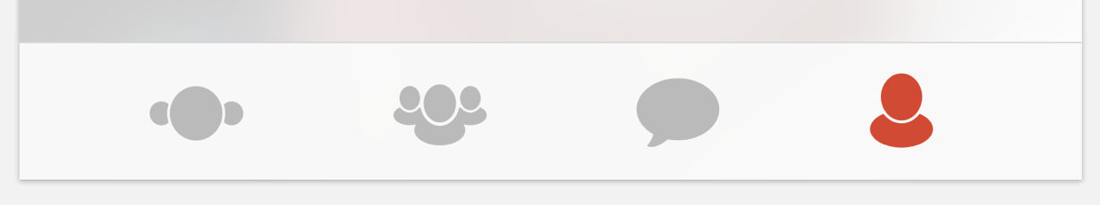
In the process I was asked to design custom iconography for our tab bar and a few other sections. I was using Adobe Illustrator to create the icons. I’ve run color blind test to make sure that people with color blindness can differentiate between active and inactive icon states.
How people with normal eyesight see
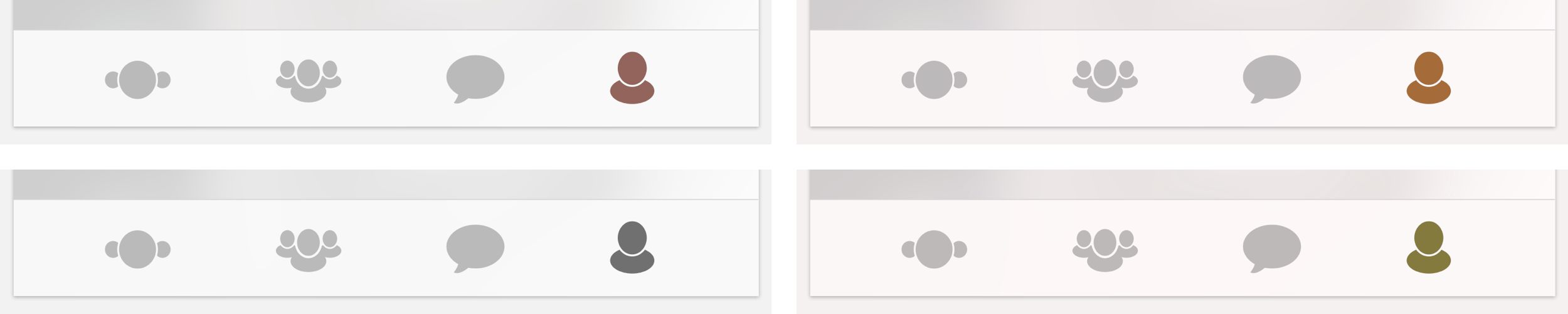
How people with color blindness would see

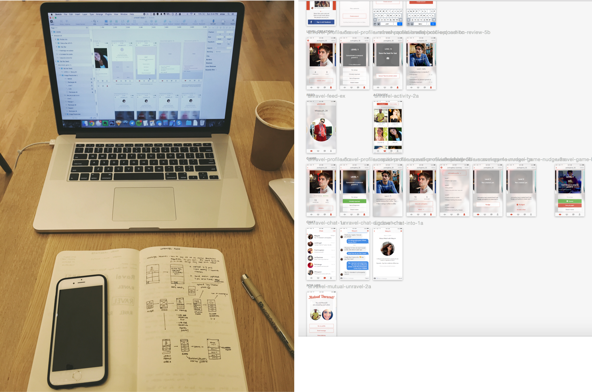
Wireframing version 2.0 and collection of artboards of the current version.
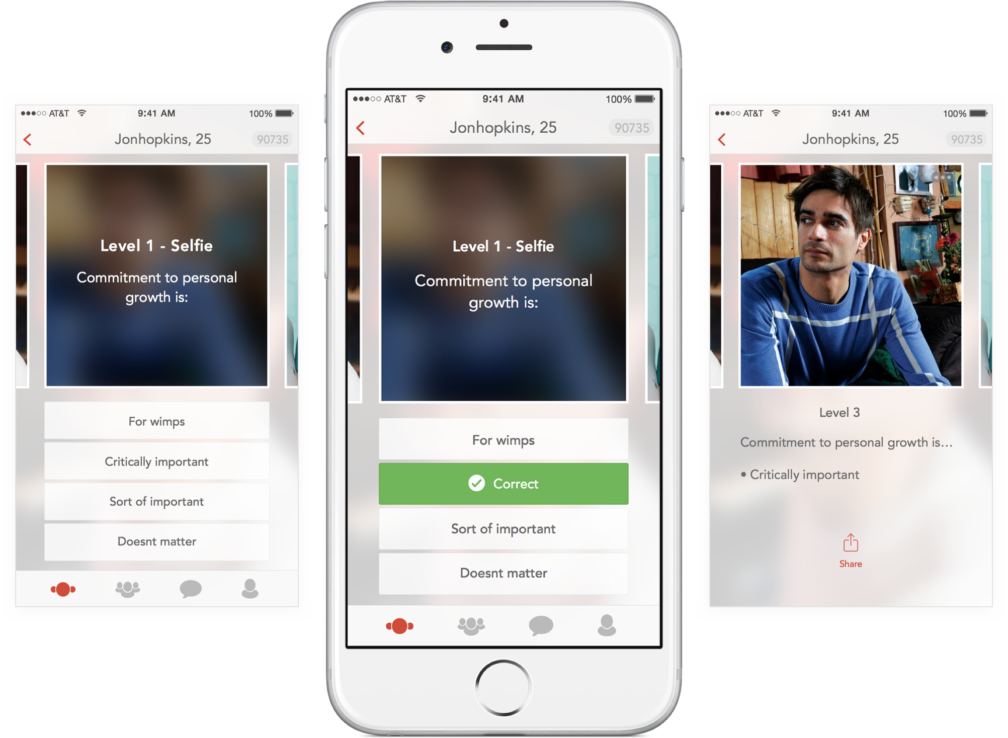
Game interaction
2.0
Since our official launch in February, I’ve learned a lot from all the A/B tests, and user interviews we have done to start designing a better — 2.0 version of Unravel. Improved layout, smooth onboarding and content creation experience, and a new game flow are coming soon.
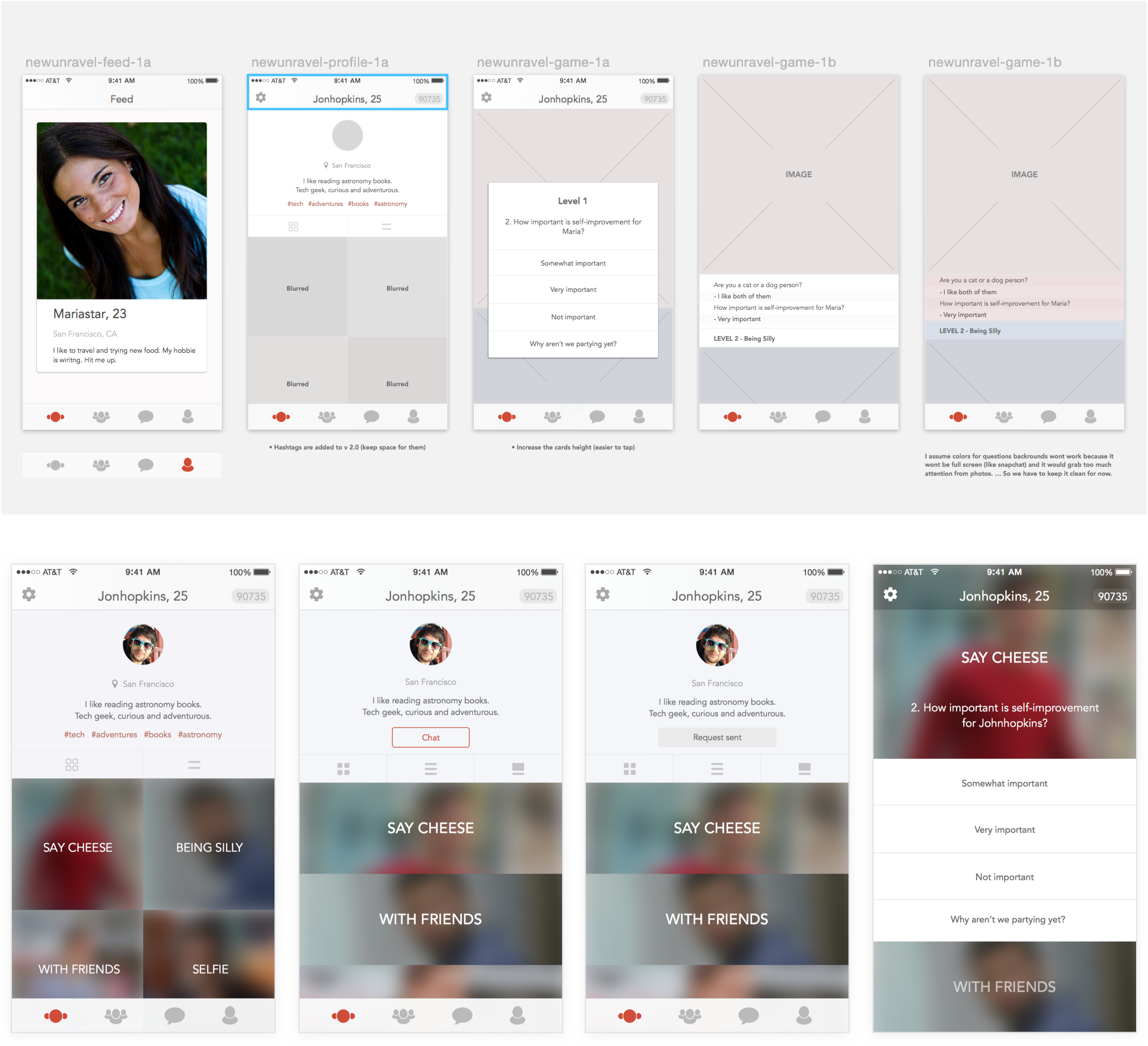
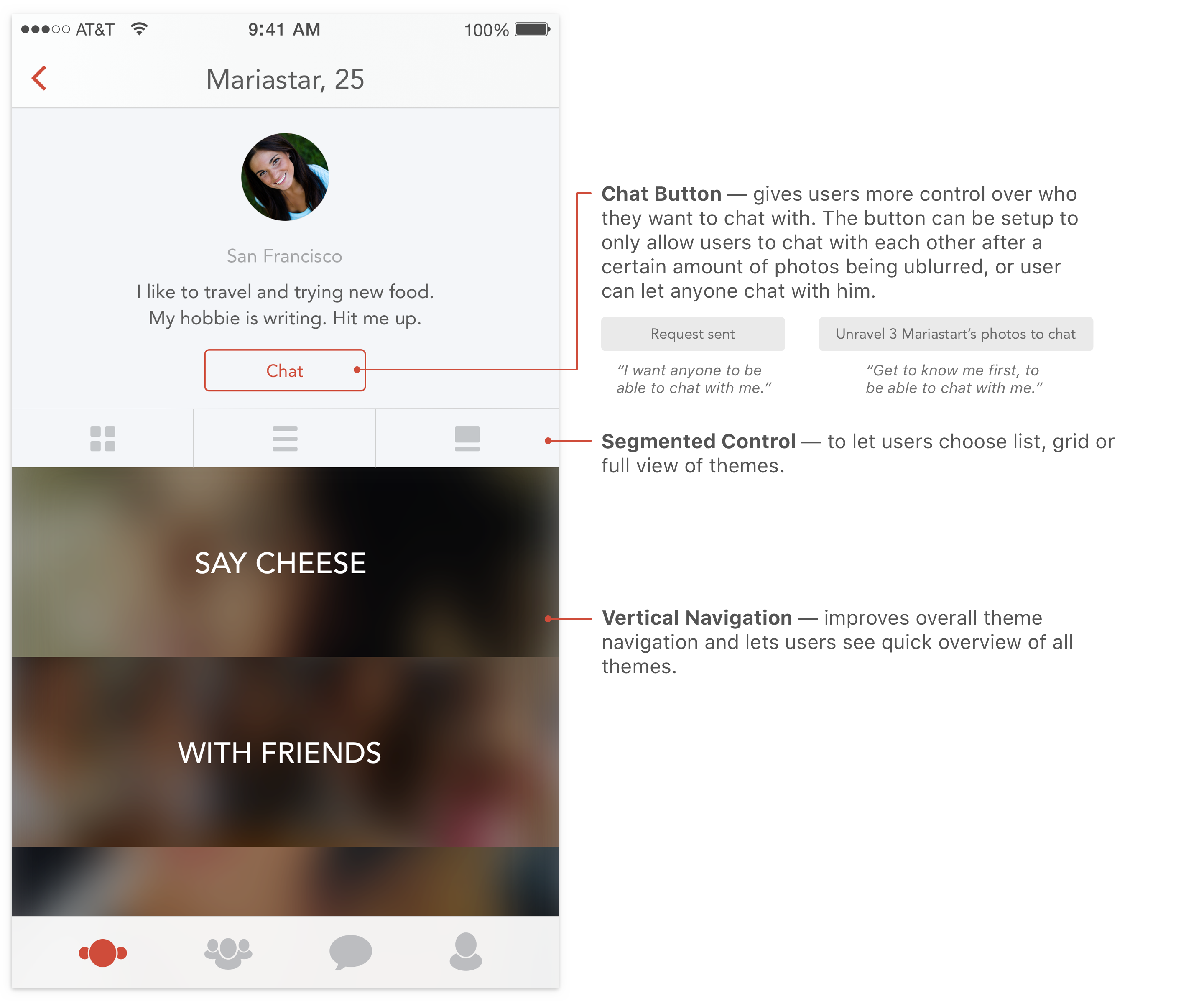
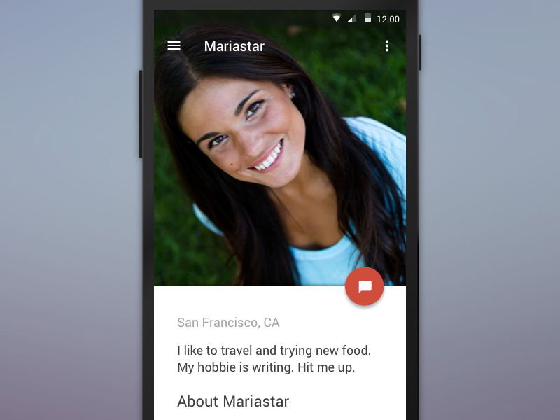
One of the main improvements in the 2.0 version was profile and game. Users now have more control over chat configuration, profile and game navigation. Tag line was added to your profile to give a little more information about yourself. View my InVision prototype here.
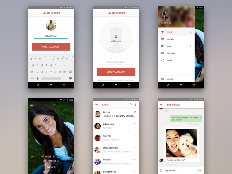
IMPROVING SIGNUP FLOW
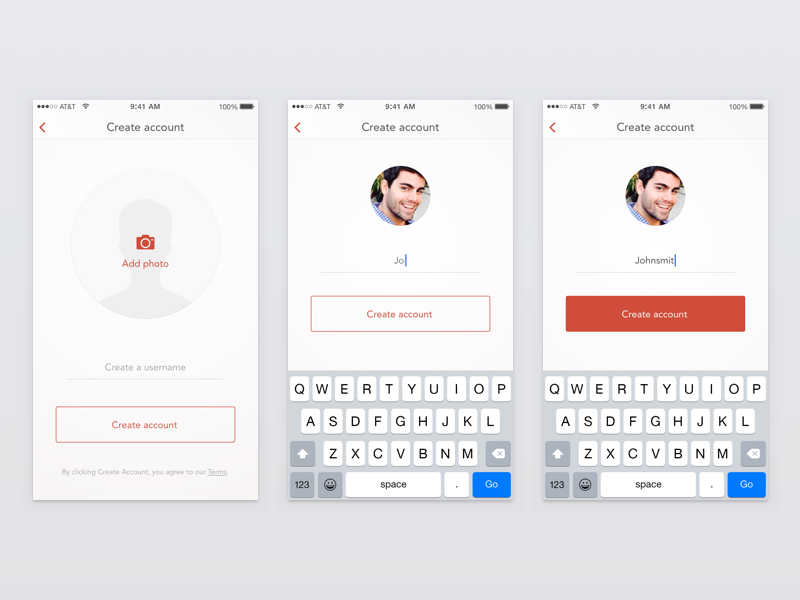
One subtle detail about this flow — the button “Create Account” becomes filled only after 3 characters has been written for username. That way it’s a little hint to a user that the chosen username is good to go. Prior to that we had a problem where new users would try to choose a username consisting of only 2 characters. Due to a technical constraint we wanted to indicate that 3 characters are required in a subtle way. Another way to guide user's attention was through a dynamic photo placeholder. The placeholder is the largest element on the screen and calls for action, but it decreases in size after the photo is chosen. Now all the attention is on the username input.
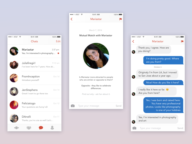
BREAKING THE ICE
Instead of having the chat screen be empty after two people match, we decided to give both parties a something in common to start a conversation. As a result of this, more people were sending first messages, and more people in return would respond, since the messages were more relevant to their interests.
ANDROID
Since December I’ve also been designing the Android version of Unravel utilizing Google’s material design guidelines. It recently came out in the Google Store, but it’s still at a very early stage.
2016 update. I left Unravel in 2015, but today the product is no longer available.

